What Actually Works for Reliable, Professional Visuals
AI can now generate stunning visuals in seconds.
That does not mean it can generate accurate infographics.
In 2026, most “AI infographic generators” are optimized for aesthetics, not truth.
They are great at layout, color, and composition.
They are still weak at:
- Numerical accuracy
- Data consistency
- Faithful representation of sources
- Chart semantics and scale
This gap between pretty and correct is the biggest hidden failure in AI-generated infographics.
Most creators only judge how it looks.
Professionals care whether it’s actually right.
This guide is not about which tool looks nicest.
It’s about how to produce infographics you can trust.
The Core Problem: Visual ≠ Correct
Most AI visual tools optimize for visual plausibility, not data fidelity.
They aim to produce something that looks like an infographic, not something that is grounded in verified, structured data.
This leads to common professional failures:
- Bars that don’t match labels
- Percentages that don’t sum to 100
- Numbers that drift from the source
- Charts that visually misrepresent scale
The output looks credible.
The data often isn’t.
That’s not a bug.
It’s how most models are trained.
Data Distortion Is the Default, Not the Exception
Text-to-image and text-to-infographic systems frequently:
- Approximate numbers
- Round inconsistently
- Invent intermediate values
- Smooth or reinterpret trends
Even when you paste correct data, the rendered visual may not reflect it faithfully.
This is especially dangerous for:
- Business reporting
- Educational content
- Investor materials
- Research summaries
In these domains, small distortions destroy trust.
Text Accuracy Failures (The Silent Killer)
Another common failure mode:
- Mismatched labels
- Hallucinated captions
- Incorrect legends
- Conflicting annotations
The model optimizes for narrative coherence, not data integrity.
So you often get visuals that read well but are factually wrong.
This is how misinformation sneaks into “professional-looking” graphics.
Layout vs Meaning (Where AI Still Fails)
AI is good at layout patterns.
It is still weak at understanding what a chart actually means.
So you get:
- Correct-looking layouts
- Incorrect semantic relationships
- Misleading visual emphasis
The design is right.
The meaning is wrong.
This is one of the most dangerous failure modes, because it’s hard to spot.
The 4 Categories of AI Infographic Tools (2026)
Understanding the category matters more than picking a brand.
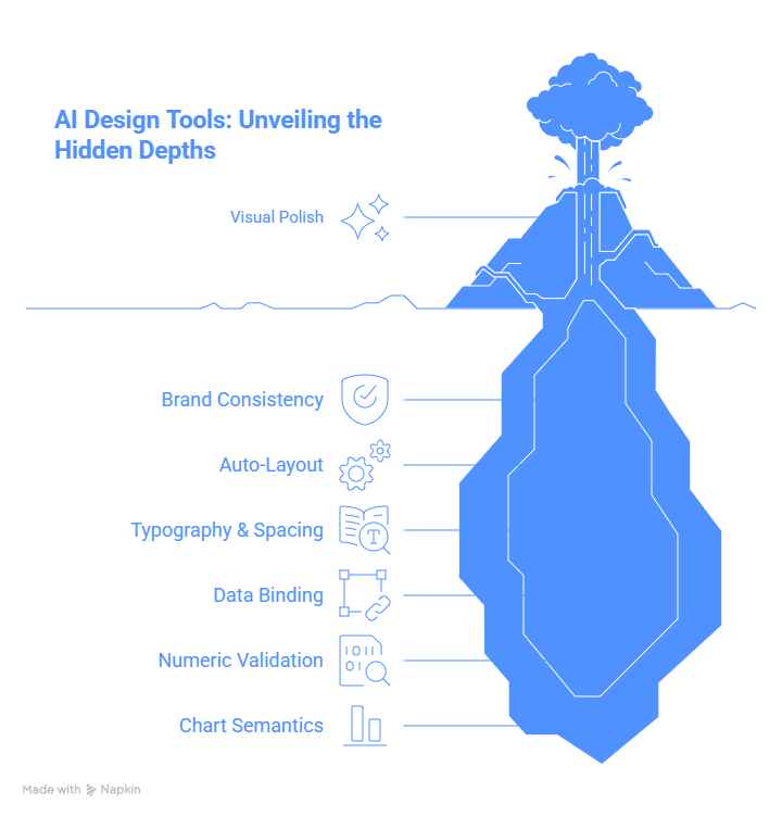
1. AI Design Tools (Layout-First)
These are design platforms with AI layered on top.
What they’re good at:
- Visual polish
- Brand consistency
- Auto-layout
- Typography and spacing
What they’re bad at:
- Data binding
- Numeric validation
- Chart semantics
Best for:
Marketing and social visuals where accuracy is low-risk.
These tools are designers, not analysts.
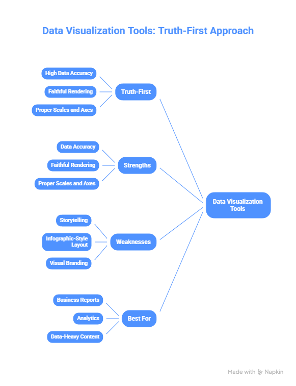
2. Data → Chart Tools (Truth-First)
These convert structured data into charts.
What they’re good at:
- High data accuracy
- Faithful rendering
- Proper scales and axes
What they’re bad at:
- Storytelling
- Infographic-style layout
- Visual branding
Best for:
Business reports, analytics, data-heavy content.
These tools protect truth, but don’t tell stories well.
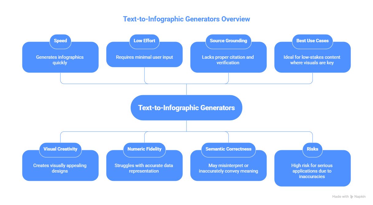
3. Text → Infographic Generators (Speed-First, Risk-Heavy)
These promise: paste text → get infographic.
What they’re good at:
- Speed
- Visual creativity
- Low effort
What they’re bad at:
- Numeric fidelity
- Source grounding
- Semantic correctness
Best for:
Low-stakes content where visuals matter more than precision.
High risk for serious use.
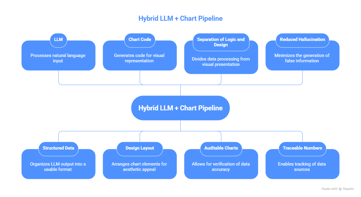
4. Hybrid LLM + Chart Pipelines (Most Reliable)
This is what professional teams are moving toward.
Architecture:
LLM → structured data → chart code → design layout
Why this works:
- Separation of logic and design
- Auditable charts
- Reduced hallucination
- Traceable numbers
This is the most reliable infographic architecture in 2026.
What to Use Based on Use Case
Marketing Visuals
Priority: Branding, aesthetics, speed
Use: AI design tools + manual copy review
Accuracy is secondary.
Educational Infographics
Priority: Correct facts, trustworthiness
Use: Structured data + chart tools + AI for layout
Avoid text-to-infographic generators.
Data-Heavy Business Reports
Priority: Accuracy, traceability, executive trust
Use: BI tools or chart-code generation
Add design polish afterward.
Social Media Carousels
Priority: Visual engagement, speed
Use: AI design tools
Manually verify numbers and labels.
Investor Decks
Priority: Credibility, precision
Rule: Never rely on text-to-infographic tools
Use validated charts + manual layout.
Pro Workflow: How Serious Teams Get Reliable Infographics
This is what professionals actually do in 2026.
Step 1 - Generate Data Separately (Non-Negotiable)
Do NOT ask AI to both invent data and visualize it.
- Generate or collect data in a table
- Keep it structured (CSV, spreadsheet, JSON)
Step 2 - Validate Before Visuals
Before any design:
- Check totals
- Check percentages
- Check consistency
- Check sources
Treat this like financial reporting.
Step 3 - Use AI for Layout, Not Truth
Use AI to:
- Suggest layout
- Choose colors
- Generate typography
- Arrange sections
But bind charts to verified data.
Step 4 - Use Chart-Code When Possible
Generate:
- Vega-Lite
- Plotly
- Chart.js
- D3 / Matplotlib
Then render.
This guarantees the chart reflects actual numbers.
Step 5 - Manual QA (Always)
Always review:
- Do bars match labels?
- Do numbers match sources?
- Do legends match data?
- Are axes correctly scaled?
- Are percentages mathematically valid?
This step catches most AI failures.
Tool Reality Check (How Pros Actually Use Them)
Most AI infographic tools are:
Good at:
- Making things look nice
- Auto-layout
- Turning text into visuals
Bad at:
- Preserving numerical accuracy
- Understanding chart meaning
- Maintaining semantic integrity
So the real question is not:
Which tool makes the prettiest graphic?
It’s:
Which workflow prevents meaning corruption?
The Hidden Problem Everyone Ignores
AI tools still:
- Change numbers for “cleaner visuals”
- Compress ranges
- Reword stats incorrectly
- Reorder categories semantically wrong
- Replace distributions with icons
These are not cosmetic changes.
They change interpretation.
Pro Infographic QA Checklist (2026)
Before publishing:
- Re-check every number
- Verify chart labels
- Confirm axis scales
- Compare against source data
- Read captions literally
- Ask: Does this visual change interpretation?
Most teams skip this.
That’s why so many AI infographics are misleading.
The Honest Take
In 2026, AI infographic tools are great at:
- Design
- Layout
- Visual storytelling
They are still unreliable at:
- Numeric accuracy
- Faithful data representation
- Semantic chart meaning
If you care about credibility:
Treat AI as a designer, not as a data source.
Use AI to make things look better.
Do not trust it to make things true.


.png&w=1200&q=75)